-
Branding
-
Design
-
Print
-
Digital
Project Signature
Brand Refresh
Creative Breif
Optical Communications, a division of Corning, was looking to do a brand refresh. Each division had its own look that fit within the overall corporate brand. Because of the amount of collateral coming from this division, Optical Communications was the only division that had an internal creative team. Creative Services was tasked with bringing the division’s look more up to date. Various leadership touch points were to done be along the way to ensure compliance to the corporate brand.
Tools
-
Illustrator
-
InDesign
-
Photoshop
My Role
Lead Designer
Deleverables
70+ Assets
Challenges
- Push the limits of the corporate style guide while still staying on brand.
- Be more approachable. Creative was given third-party feedback that the current brand was seen as arrogant.
- The new look would need to be extremely modular and versatile because of the company’s global positioning and breath of products.
Process
-
01
Creative Exploration
-
02
Brand Presentation
-
03
Refinement
-
04
Corporate Review
Results
- My idea was chosen as a finalist to present to corporate.
- I lead a small team to better refine my original concept.
- Corporate implemented an extremely scaled back version of my team’s final presentation.
I lead a team to refine my original idea that was chosen as the final concept for our new corporate brand.
The Creative Director put together a brainstorming session were all designers discussed ideas and how to best represent the brand. From that session the designers had time to individually put together ideas to present to the team. From those ideas, we narrowed down and iterated until the Creative Director chose 2 concepts to move forward with.
One of my ideas was chosen as part of the final 2. The designers were then split into 2 groups to further challenge the concepts. I was the team lead for my concept. I really appreciated the perspective the other designers brought to my original idea. It was through working together that we were able to transform the idea into a working brand that could be used in all facets of the business.
While the creative department was very proud of the work that was presented, corporate ultimately chose to implement an extremely scaled back version of my team’s pitched idea. This more minimal approach was used in advertising, product design, packaging, building graphics, and more. While the outcome wasn’t quite what we were shooting for, my efforts were not forgotten and lead to other opportunities in the future.
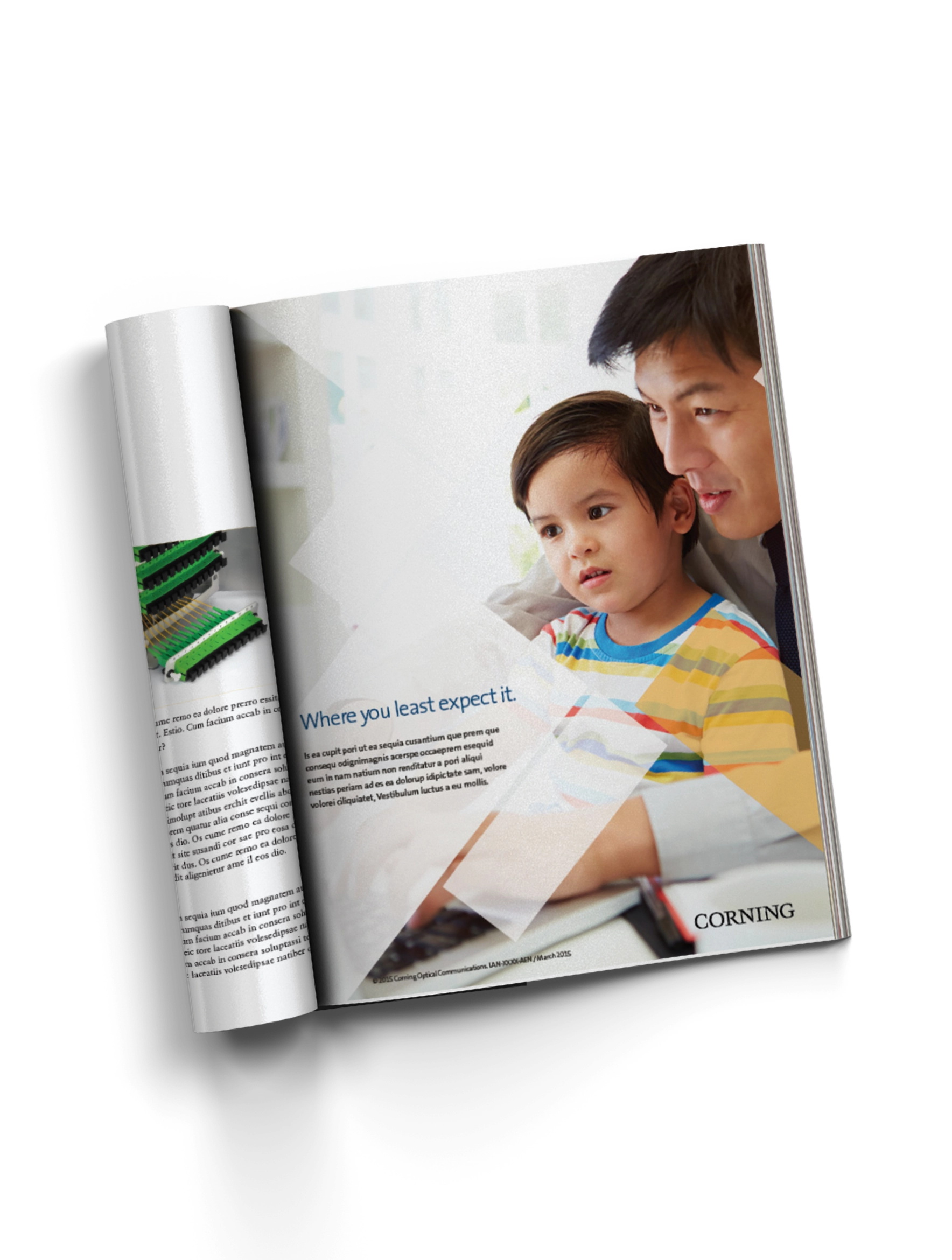
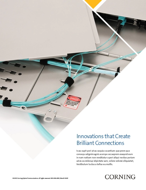
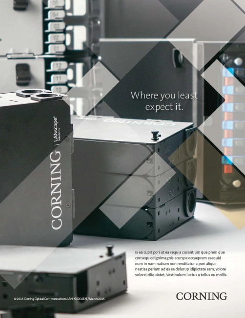
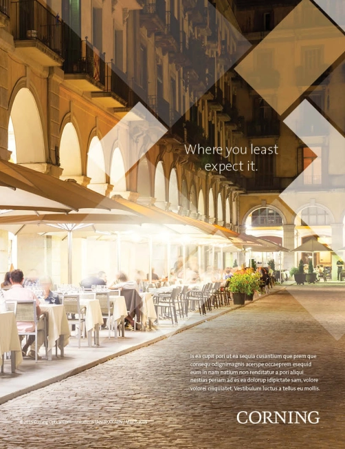
Print Ads

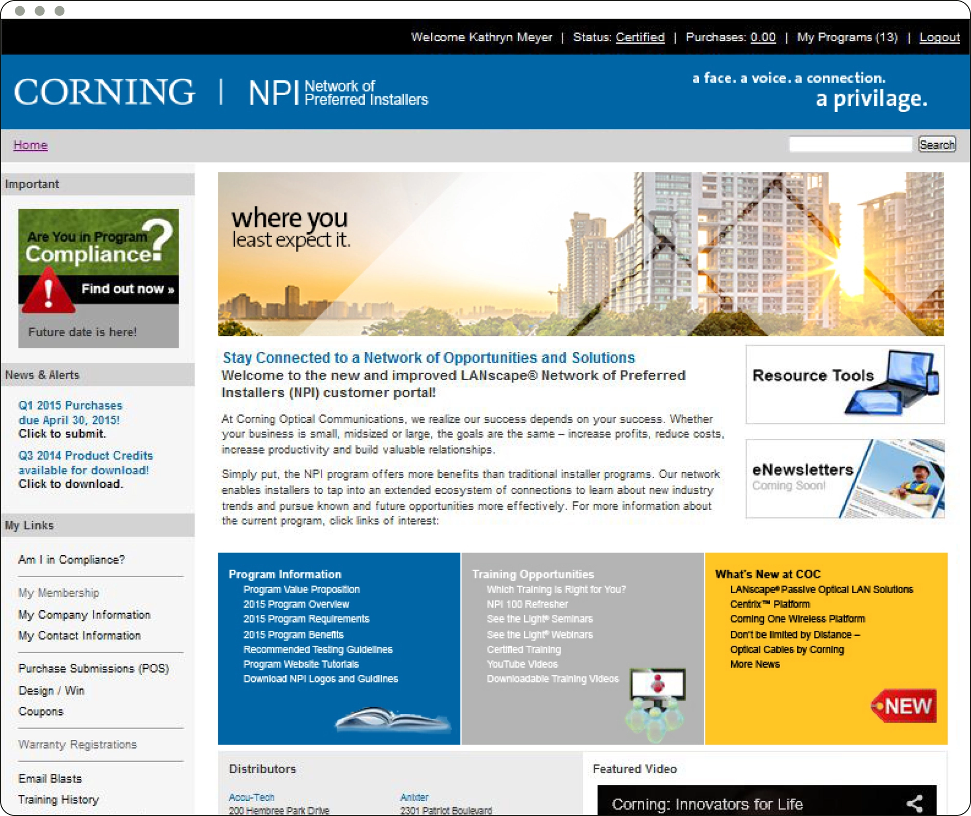
Portal Banners
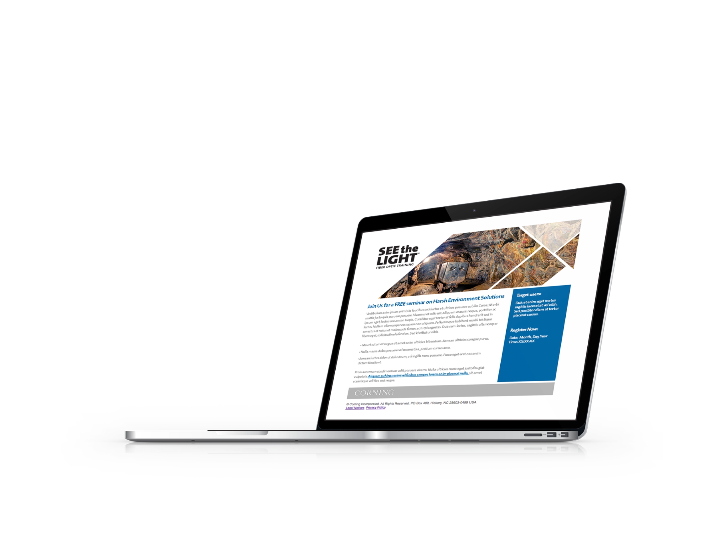
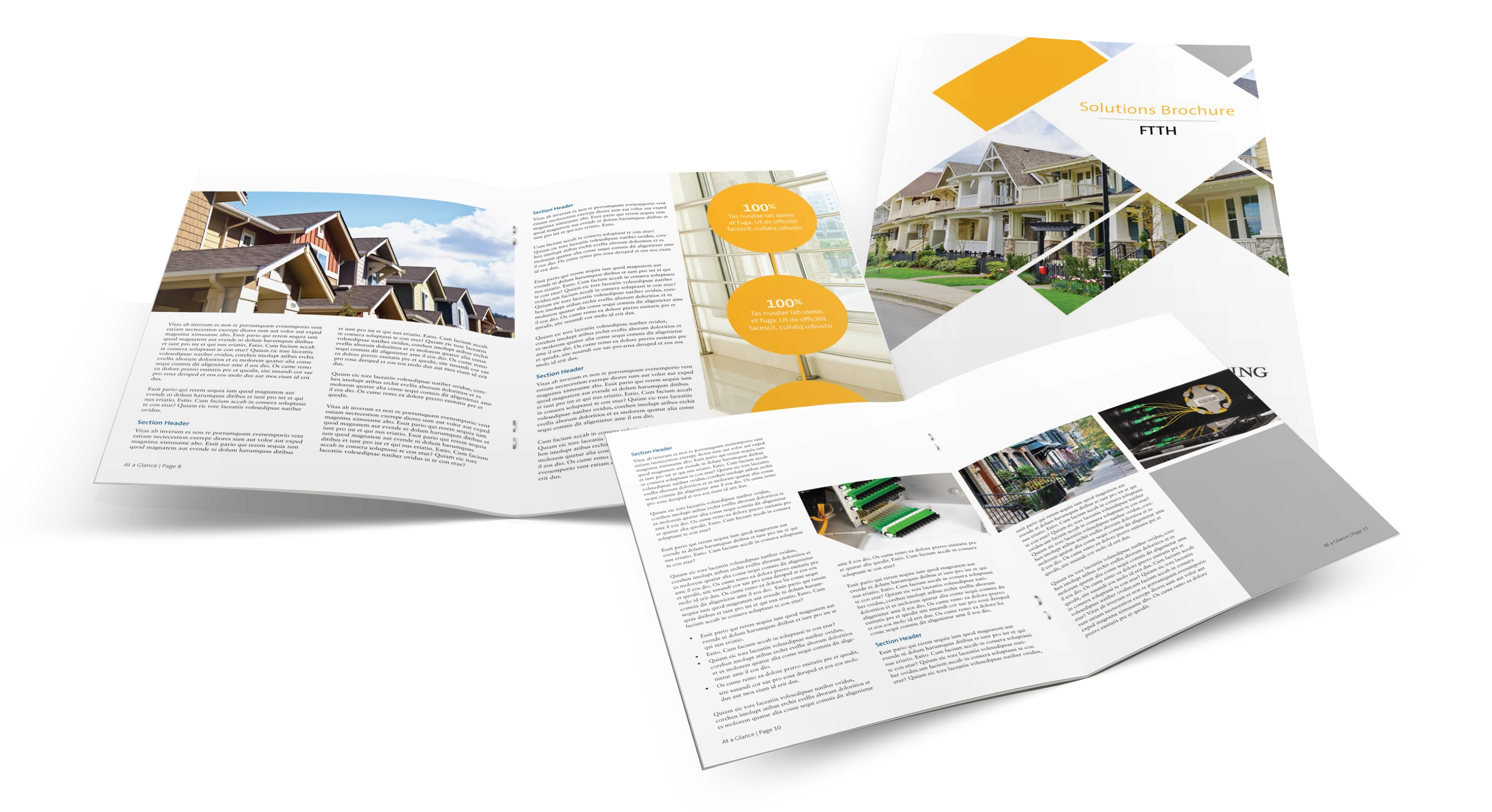
Brochure Design


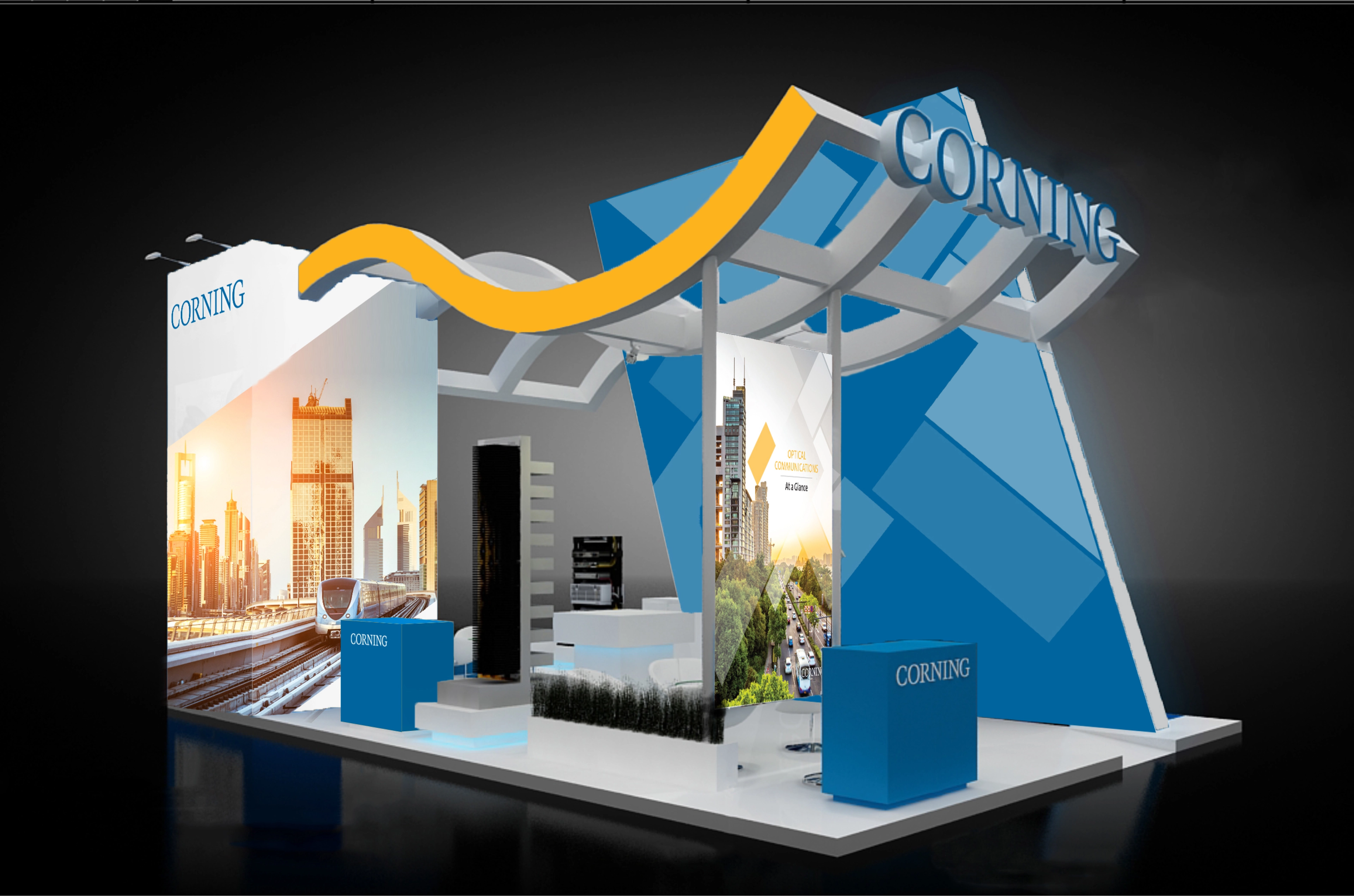
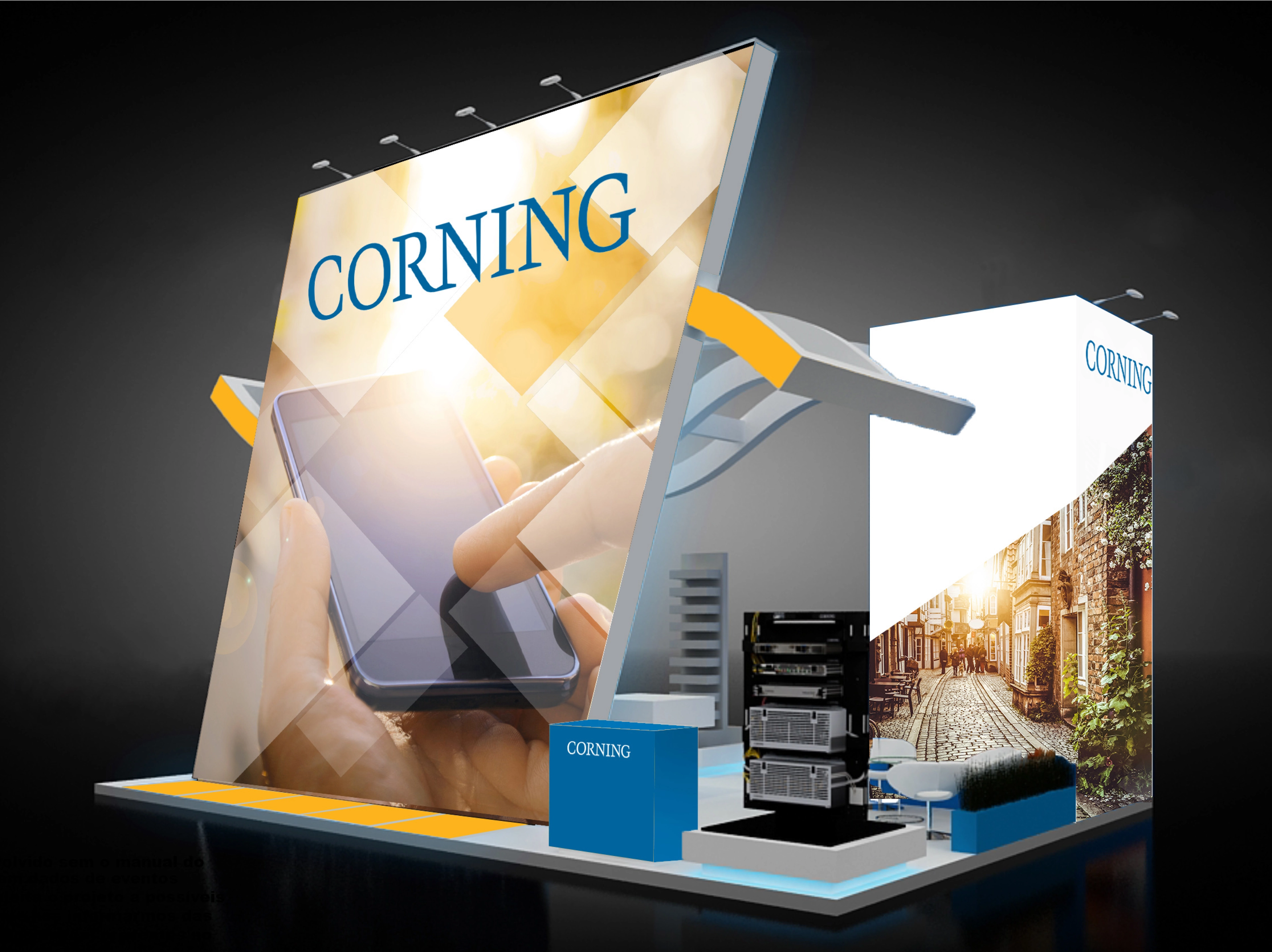
Trade Show Booth
Like What You See?
Let's Connect!
